
Numéro by Fireal RESONANCE®
webflow
$49Trend Report·10 min read
What's Actually Worth Your Attention
An honest read of where landing page design is heading in 2026: the trends worth your time, the ones being overhyped, and the few that'll still matter when everyone moves on.
Every year brings a new wave of 'top trends' articles that list the same fifteen things in a slightly different order. Bento grids. Dark mode. Bold typography. Micro-interactions. You've read it before. What follows is a more honest read: which trends are genuinely new, which are being massively overhyped, and which ones will still matter when the hype fades. Drawn from hundreds of real landing pages in the Muzli ecosystem and checked against what leading design teams are shipping right now.
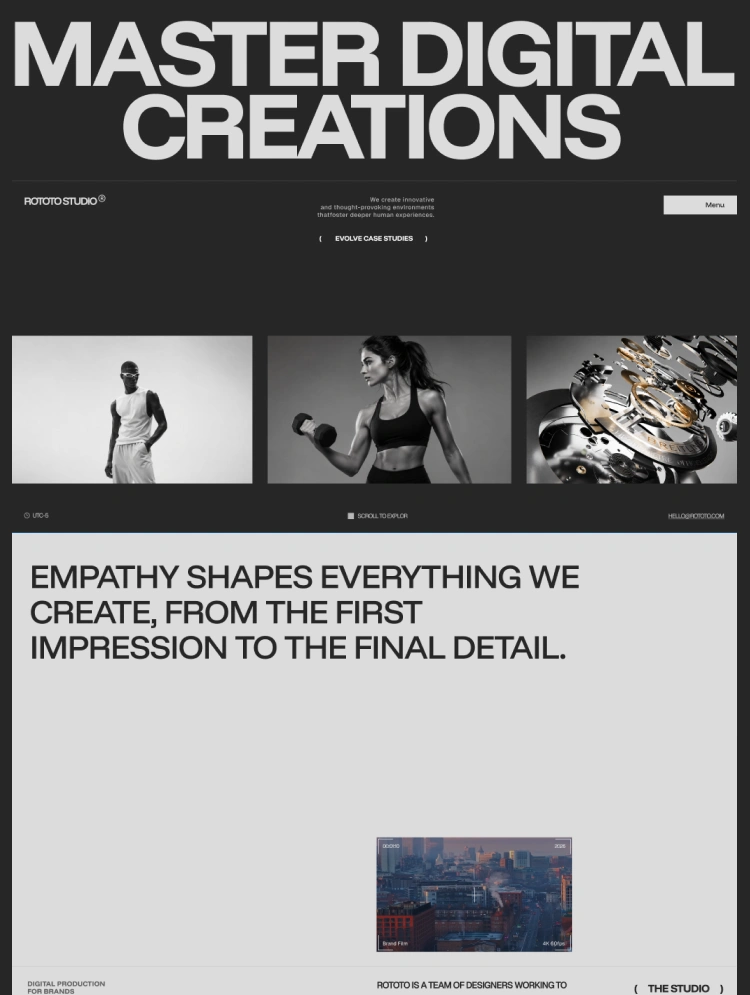
AI tools have raised the floor of design quality dramatically. Generating a competent, clean, well-structured landing page now takes minutes. The result is a web that looks increasingly similar. Better on average. But more homogeneous. The pages that stand out in 2026 are the ones that make deliberate choices that feel unmistakably human: rough edges, editorial opinions, typographic personality, illustration that couldn't have come from a prompt.
The tension is real: AI democratizes competence, so craft becomes the differentiator. Keep that in mind as you read what follows.
Cyberbrutalism, with its ASCII aesthetics, glitch effects, pixel art, decoratively repurposed system UI, and deliberately 'broken' layouts, is real and growing. It shows up in developer tools, creative studios, music brands, and anywhere that wants to signal authenticity over polish.
What makes it work isn't the rawness itself. It's that the rawness is intentional and controlled, the digital equivalent of a band releasing an album with intentional tape hiss. The execution is meticulous. It doesn't look like it.
The honest caveat
This trend has a narrow audience window. It works beautifully for creative agencies, developer-first products, and cultural brands targeting under-35s. It fails badly for financial services, healthcare, B2B enterprise, or anywhere that conventional polish signals trustworthiness. Treat it as a specific tool for specific contexts, not a general aesthetic direction.
What to steal (carefully)
Even if full cyberbrutalism isn't right for your product, the underlying principle (deliberate imperfection as a trust signal) applies more broadly. Handwritten type accents, uneven layouts, visible grid lines. Small doses of rawness in an otherwise polished page can make it feel more human without alienating mainstream audiences.
From the store
Flat design has dominated the web for over a decade. In 2026, it's starting to feel emotionally thin. The response is a broad shift toward volumetrics: interfaces and visuals with genuine physical presence. Depth. Texture. Materiality. Weight.
Glassmorphism maturing. The blurry-card trend from 2021 was immature and overdone, but the underlying impulse, UI elements that feel translucent and layered, is now being executed with much more restraint and skill. Apple's Liquid Glass aesthetic in iOS 26 is the clearest mainstream signal that this direction has legs.
3D objects as hero visuals. AI image generation has made photorealistic 3D product renders fast and cheap. The best ones in 2026 follow a specific formula: a single hero object, clear material (glass, metal, stone, liquid), deliberate lighting, minimal background.
Textured typography. Headlines with physical texture (stone, fabric, liquid, chrome) are replacing the flat gradient text that defined 2022–24. The tools have caught up: what used to require Cinema 4D is now achievable in Figma plugins or through AI generation in minutes.
What to steal
Pick a material metaphor for your product. Reliable service → stone. Creative agency → liquid. Technical precision → machined metal. Then express that material in one place: your hero visual, your CTA button texture, or your section divider. You don't need volumetrics everywhere; you need it somewhere intentional.
From the store
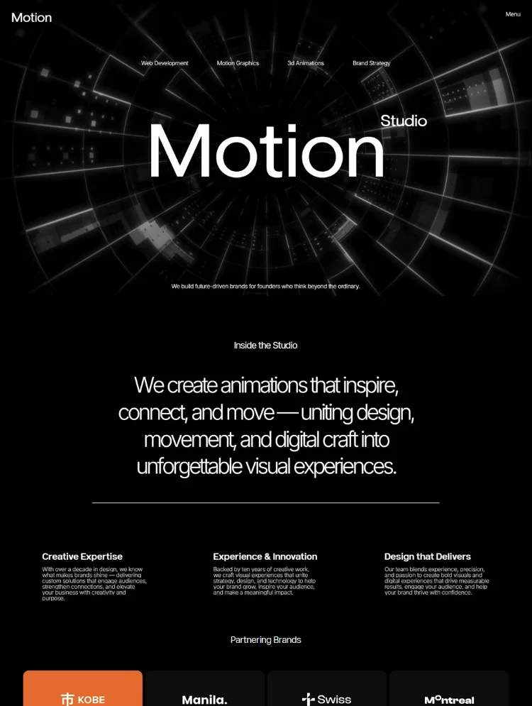
WebGL-powered interactive 3D has been possible for years, but it required specialist developers. In 2026, tools like Spline have democratized it to the point where a solo designer can ship a polished interactive 3D hero in an afternoon.
Done well, interactive 3D creates a memorability that flat design simply can't match. A product that rotates as you scroll, a 3D character that reacts to your cursor. These are the moments users screenshot and share.
But the barrier dropping means we're about to see a wave of gratuitous, slow, inaccessible 3D that adds nothing but load time. The same thing happened with parallax in 2013 and Lottie animations in 2019.
The rule that separates good from bad
Interactive 3D earns its place only when it communicates something the product does or is. A 3D model of your physical product? Yes. An abstract floating orb because it looks futuristic? No.
Performance is non-negotiable
53% of mobile users abandon pages that take over 3 seconds to load. Interactive 3D that isn't lazy-loaded, compressed, and tested across device classes will hurt your conversion rate, not help it.
From the store
Animated headlines, words that cycle, morph, split, and sequence, have crossed the threshold from novel to expected. In 2025 it was a differentiator. In 2026, its absence on certain categories of landing page (AI tools, SaaS, creative agencies) is starting to feel like a choice.
Execution quality has risen dramatically, and so has accessibility. Framer's scroll-triggered text animations, variable font transitions, and sequence effects now require minimal code. The templates that do this well are all over the Muzli Store.
The most effective kinetic typography in 2026 isn't decorative; it's structural. It solves a real copywriting problem: how do you fit a multi-benefit value proposition into a single headline? You sequence it. 'The [fastest / simplest / most flexible] way to ship' with the adjective rotating is more engaging than any static alternative, and it tests different value props in real time.
The accessibility caveat that everyone ignores
All motion on a page needs a prefers-reduced-motion media query. Users with vestibular disorders can experience genuine physical discomfort from animated text. This isn't optional. It's a legal consideration in some jurisdictions and a basic respect for your users in all of them.
From the store
Every trends piece in 2026 includes AI-powered personalization: pages that adapt their hero content, product recommendations, and messaging based on where you came from, what you've done before, and what you're likely to want.
The technology is real. For large-scale ecommerce (personalization can improve conversions by up to 202%) and high-traffic SaaS products, it's a genuine lever. For most teams building landing pages in 2026, it's a distraction.
Personalization requires traffic to generate meaningful patterns, data infrastructure to store and act on behavioral signals, and ongoing optimization to keep the models accurate. If you have under 10,000 monthly visitors, the impact of even perfect personalization is smaller than fixing your headline, improving your CTA copy, or adding a real testimonial.
The accessible version of this trend
Traffic-source personalization is the 20% effort that gets you 80% of the benefit. Show different hero messaging to visitors coming from LinkedIn versus Google versus direct. This doesn't require ML; it requires UTM parameters and conditional logic, which most landing page builders support natively.
Most landing pages treat navigation as a solved problem: logo left, links right, CTA button. It's safe, it's invisible, and it's becoming increasingly generic.
The more interesting work in 2026 is happening at the intersection of navigation and scroll: floating nav bars that appear on scroll, navigation that responds to cursor position, pages with no visible navigation at all until you need it, and (most interestingly) single-page layouts that fit everything above the fold by making radical choices about information hierarchy.
The principle driving this isn't aesthetic novelty. It's conversion focus. Every link in a navigation bar is an exit ramp from your primary conversion path. The question 'do we need navigation on this landing page at all?' is being asked more seriously than at any point in the last decade, and the data often supports removing it entirely for focused campaign pages.
The practical test
Before your next landing page launch, run a version with no navigation for two weeks. Measure conversion rate and bounce rate. You may be surprised.
Of all the trends listed in the major 2026 roundups, this one has the strongest data behind it and the least aesthetic baggage.
Decreasing mobile load time by 0.1 seconds increases retail conversion rates by 8.4% (Deloitte/Google research). 53% of mobile users abandon pages that take more than 3 seconds. Core Web Vitals are a direct Google ranking factor. Mobile now accounts for 83% of landing page traffic on average.
Performance isn't a design trend in the visual sense. But it shapes every design decision you make. Whether you use video backgrounds. How many custom fonts you load. Whether your 3D hero is lazy-loaded. How your hero image is compressed. Whether your animation library is tree-shaken.
Where to start
Largest Contentful Paint (LCP) under 2.5 seconds is the target. Run your current page through PageSpeed Insights. The top recommendation is almost always the same: compress your hero image. That single change often moves LCP by half a second.
The most counterintuitive trend on this list: landing pages that read more like magazine features than product pages.
Driven partly by the success of companies like Linear, Stripe, and Notion at telling rich product stories through their marketing sites, and partly by buyer sophistication that sees through conventional feature-benefit structures, a category of long-form editorial landing page is emerging and performing well.
These pages take a position. They build an argument. They use editorial layout tools: pull quotes, large statistics, photography, section breaks. All of it builds reading momentum. They run 2,000 to 4,000 words and convert at higher rates than their shorter counterparts for complex or expensive products, because the people who read to the end arrive genuinely convinced.
The format suits B2B SaaS, agencies, professional services, and anyone selling something that requires trust to buy. It doesn't suit impulse purchases, commodity products, or anything where the decision is made on price alone.
What to steal
Write your landing page as a persuasive essay. State the problem clearly. Build the case that existing solutions fail. Introduce your product as the inevitable answer. End with a strong CTA. Then apply editorial layout thinking: what deserves a full-width callout? What should be a pull quote? Where does a visual earn its place?
Keeps getting listed as a major trend and keeps failing to materialize at scale. The handful of examples are memorable precisely because they're outliers. For most products, adding game mechanics to a landing page is a distraction from conversion, not an aid to it.
Has been listed as a coming trend every year since 2020. It looks beautiful in Dribbble shots and terrible in real interfaces where accessibility and usability matter. The soft, embossed shadow effects fail WCAG contrast requirements almost by definition. This one is for portfolios, not products.
Genuinely interesting aesthetically but has an extremely narrow application window: nostalgia brands, cultural projects, certain gaming contexts. Most brands adopting it in 2026 will look dated by 2027.
Look across all of these trends and one principle keeps surfacing: intentionality beats novelty.
The pages doing interesting work in 2026 aren't the ones that adopted the most trends. They're the ones that made deliberate choices (what to show, what to cut, what to move, what to leave still) and executed those choices with discipline.
The cyberbrutalist page works because every 'broken' element is deliberately broken. The volumetric hero works because the material metaphor was chosen to match the brand. The editorial long-form works because the argument was written before the layout was designed.
That's always been the standard. The tools just keep getting better at exposing how many teams aren't meeting it.